


PermalinkIntroduction
In this blog, we will discuss the box model used to design webpages.
PermalinkThe box model
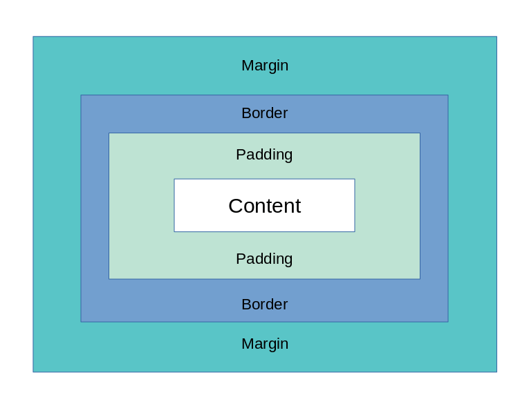
The box model is a way to describe how HTML elements are placed within their own borders. The four main parts of HTML are:
margins and padding
width, height, and content
The difference between them can be illustrated by comparing margin (which is relative to the parent element) with padding (which belongs to its own element). A box is said to have a left or right margin if it's positioned on top or bottom respectively. It has an edge if there's no other side border available around it; an inset area where you can see through into the content (think about how newspapers print); or a cutout effect where you can see through into another part of your webpage but not directly into its contents. Similarly, you could say that an inline has either no room for other elements besides itself - like text - or does have space around it which allows extra lines around specific areas like headings, etc...
PermalinkMargin
Margin is the space between the edge of an element and its content. It can be defined using length values or using keywords, such as top, right, and bottom—or it can be applied to all four sides of an element.
PermalinkMargin has 4 main Properties
margin-left: 10px;
margin-right: 10px;
margin-top: 20px;
margin-bottom: 20px;
PermalinkThere are some short form for margin properties
margin: margin-top margin-right margin-bottom margin-left;
OR
margin: [top and bottom margins] [left and right margins];
OR
margin: margin-top [left and right margins] margin-bottom;
PermalinkExample
margin: 20px 10px 20px 10px;
OR
margin: 20px 10px;
OR
margin: 20px 10px 20px;
Margins are often used to align elements within a page layout so that they look uniform when viewed from above or below; they also help make the text easier to read by giving you more room around it when necessary.
PermalinkBorder
The border is the line around the box. It can be solid, dashed, dotted, or none at all. Border thickness varies from thin to thick. A border may also have a color or gradient applied to it (if you're feeling fancy). A properties border,border-radius can easily make rounded corners
PermalinkThe border also has properties such as
border-style: solid;
border-radius: 5px;
border-width: 5px;
border-color: red;
PermalinkWith The Short Hand
border: border-style border-width border-color;
border-radius: 5px;
PermalinkYou Can Style The Border of only one side if you want
border-top-style: dotted;
border-right-style: solid;
border-bottom-style: dotted;
border-left-style: solid;
PermalinkAnd Short Hand is also available for Sides
border-right: border-right-style border-right-width border-right-color;
border-left: border-left-style border-left-width border-left-color;
border-top: border-top-style border-top-width border-top-color;
border-bottom: border-bottom-style border-botttom-width border-bottom-color;
PermalinkBorder Radius also is one property for all sides
border-radius : top right bottom left;
All the shorthand tricks of margin will also work for border-radius
PermalinkPadding
The padding property defines the space between an element and its border. This space can be set on an individual basis or as a percentage of its width.
The padding property accepts either an integer or a percentage value, which specifies how much to add for each side (left, top, right, and bottom). If you want to add padding to all sides equally then use 0%; if you only want the left side padded then use 10px of padding; etc...
PermalinkPadding has 4 main Properties
padding-left: 10px;
padding-right: 10px;
padding-top: 20px;
padding-bottom: 20px;
PermalinkThere are also short forms for padding properties
padding : padding-top padding-right padding-bottom padding-left;
All the shorthand tricks of margin will also work for padding
PermalinkContent
Content is the element that is displayed. The size of the content box is determined by the size of its parent, which in turn is determined by its CSS values. Content width and height are measured from the content box to the outermost edge of its border, padding and margin (if any).
The content area contains everything but text decoration such as borders or backgrounds; you'll find them in your HTML file just like any other elements, etc., but unlike these other elements they won't have their own CSS stylesheet attached to them.
The box model is used to design web pages.
The box model is a way of describing how webpages are designed. It's used in CSS and HTML, which are the two languages that make up the core of your website. You can think of it as an outline for what goes where on the page, so you know exactly where to place elements like images, text, shapes, and lists.
The most common example is when you want to position an image inside a container element (like a div). You'll need to tell it how tall and wide it should be based on its height or width in pixels. This will allow other elements on your site like paragraphs or links line up neatly around them without any gaps between them!
PermalinkBonus: What is Box Sizing property?
The box-sizing property is used to determine how the CSS box model applies to elements. It can be set to border-box, content-box, or padding-box.
The default value of box-sizing is content-box, which means that elements will be sized according to their contents (their own width and height). If you want an element's width or height to match its parent's dimensions then set this property's value accordingly.
PermalinkConclusion
The box model is an important part of web design. It helps us create balanced, well-structured interfaces that look good and function smoothly.